California august temperature anomaly
How anomalous was the August 2020 average temperature?
In this first section, we load required packages and modules
[1]:
##This is so variables get printed within jupyter
from IPython.core.interactiveshell import InteractiveShell
InteractiveShell.ast_node_interactivity = "all"
[2]:
##import packages
import os
import xarray as xr
import numpy as np
import matplotlib.pyplot as plt
import cartopy
import cartopy.crs as ccrs
import matplotlib.ticker as mticker

#for rank calculation
# import bottleneck
[3]:
os.chdir(os.path.abspath('../../'))
Load ERA5
We have retrieve netcdf files of global monthly 2m temperature and 2m dewpoint temperature for each year over 1979-2020.
We load all files with xarray open_mfdataset.
[4]:
ERA5 = xr.open_mfdataset('E:/PhD/California_example/ERA5/ERA5_????.nc',combine='by_coords') ## open the data
ERA5#
[4]:
<xarray.Dataset>
Dimensions:    (latitude: 51, longitude: 61, time: 42)
Coordinates:
  * longitude  (longitude) float32 -130.0 -129.0 -128.0 ... -72.0 -71.0 -70.0
  * latitude   (latitude) float32 70.0 69.0 68.0 67.0 ... 23.0 22.0 21.0 20.0
  * time       (time) datetime64[ns] 1979-08-01 1980-08-01 ... 2020-08-01
Data variables:
    t2m        (time, latitude, longitude) float32 dask.array<chunksize=(1, 51, 61), meta=np.ndarray>
    d2m        (time, latitude, longitude) float32 dask.array<chunksize=(1, 51, 61), meta=np.ndarray>
Attributes:
    Conventions:  CF-1.6
    history:      2020-10-01 23:23:34 GMT by grib_to_netcdf-2.16.0: /opt/ecmw...
xarray.Dataset
- latitude: 51
- longitude: 61
- time: 42
- longitude(longitude)float32-130.0 -129.0 ... -71.0 -70.0
- units :
- degrees_east
- long_name :
- longitude
array([-130., -129., -128., -127., -126., -125., -124., -123., -122., -121., -120., -119., -118., -117., -116., -115., -114., -113., -112., -111., -110., -109., -108., -107., -106., -105., -104., -103., -102., -101., -100., -99., -98., -97., -96., -95., -94., -93., -92., -91., -90., -89., -88., -87., -86., -85., -84., -83., -82., -81., -80., -79., -78., -77., -76., -75., -74., -73., -72., -71., -70.], dtype=float32) - latitude(latitude)float3270.0 69.0 68.0 ... 22.0 21.0 20.0
- units :
- degrees_north
- long_name :
- latitude
array([70., 69., 68., 67., 66., 65., 64., 63., 62., 61., 60., 59., 58., 57., 56., 55., 54., 53., 52., 51., 50., 49., 48., 47., 46., 45., 44., 43., 42., 41., 40., 39., 38., 37., 36., 35., 34., 33., 32., 31., 30., 29., 28., 27., 26., 25., 24., 23., 22., 21., 20.], dtype=float32) - time(time)datetime64[ns]1979-08-01 ... 2020-08-01
- long_name :
- time
array(['1979-08-01T00:00:00.000000000', '1980-08-01T00:00:00.000000000',
       '1981-08-01T00:00:00.000000000', '1982-08-01T00:00:00.000000000',
       '1983-08-01T00:00:00.000000000', '1984-08-01T00:00:00.000000000',
       '1985-08-01T00:00:00.000000000', '1986-08-01T00:00:00.000000000',
       '1987-08-01T00:00:00.000000000', '1988-08-01T00:00:00.000000000',
       '1989-08-01T00:00:00.000000000', '1990-08-01T00:00:00.000000000',
       '1991-08-01T00:00:00.000000000', '1992-08-01T00:00:00.000000000',
       '1993-08-01T00:00:00.000000000', '1994-08-01T00:00:00.000000000',
       '1995-08-01T00:00:00.000000000', '1996-08-01T00:00:00.000000000',
       '1997-08-01T00:00:00.000000000', '1998-08-01T00:00:00.000000000',
       '1999-08-01T00:00:00.000000000', '2000-08-01T00:00:00.000000000',
       '2001-08-01T00:00:00.000000000', '2002-08-01T00:00:00.000000000',
       '2003-08-01T00:00:00.000000000', '2004-08-01T00:00:00.000000000',
       '2005-08-01T00:00:00.000000000', '2006-08-01T00:00:00.000000000',
       '2007-08-01T00:00:00.000000000', '2008-08-01T00:00:00.000000000',
       '2009-08-01T00:00:00.000000000', '2010-08-01T00:00:00.000000000',
       '2011-08-01T00:00:00.000000000', '2012-08-01T00:00:00.000000000',
       '2013-08-01T00:00:00.000000000', '2014-08-01T00:00:00.000000000',
       '2015-08-01T00:00:00.000000000', '2016-08-01T00:00:00.000000000',
       '2017-08-01T00:00:00.000000000', '2018-08-01T00:00:00.000000000',
       '2019-08-01T00:00:00.000000000', '2020-08-01T00:00:00.000000000'],
      dtype='datetime64[ns]')
- t2m(time, latitude, longitude)float32dask.array<chunksize=(1, 51, 61), meta=np.ndarray>
- units :
- K
- long_name :
- 2 metre temperature
Array Chunk Bytes 522.65 kB 12.44 kB Shape (42, 51, 61) (1, 51, 61) Count 126 Tasks 42 Chunks Type float32 numpy.ndarray - d2m(time, latitude, longitude)float32dask.array<chunksize=(1, 51, 61), meta=np.ndarray>
- units :
- K
- long_name :
- 2 metre dewpoint temperature
Array Chunk Bytes 522.65 kB 12.44 kB Shape (42, 51, 61) (1, 51, 61) Count 126 Tasks 42 Chunks Type float32 numpy.ndarray
- Conventions :
- CF-1.6
- history :
- 2020-10-01 23:23:34 GMT by grib_to_netcdf-2.16.0: /opt/ecmwf/eccodes/bin/grib_to_netcdf -S param -o /cache/data4/adaptor.mars.internal-1601594610.7303944-8809-11-5de19df5-bbb2-4d5f-8e66-fa47b01efe57.nc /cache/tmp/5de19df5-bbb2-4d5f-8e66-fa47b01efe57-adaptor.mars.internal-1601594610.7313852-8809-4-tmp.grib
Calculating the anomaly
We want to show how anomalous the recorded monthly average temperature for 2020 is compared to the 1979-2010 average.
[13]:
ERA5_anomaly = ERA5['t2m'] - ERA5['t2m'].sel(time=slice('1979','2010')).mean('time')
ERA5_anomaly.attrs = {
    'long_name': 'August temperature anomaly',
    'units': 'C'
}
ERA5_sd_anomaly = ERA5_anomaly / ERA5['t2m'].std('time')
ERA5_sd_anomaly.attrs = {
    'long_name': 'August temperature standardized anomaly',
    'units': '-'
}
Plotting
We define a function to plot the data on a global map:
[14]:
def plot_California(ERA5_input):

    extent = [-120, -80, 20, 50]
    central_lon = np.mean(extent[:2])
    central_lat = np.mean(extent[2:])

    plt.figure(figsize=(12, 6))
    ax = plt.axes(projection=ccrs.AlbersEqualArea(central_lon, central_lat))
    ax.set_extent(extent)

    ERA5_input.plot(
        ax=ax,
        transform=ccrs.PlateCarree(),
    #     levels=[1, 2, 3, 4, 5],
        extend='both')#,
    #     colors=plt.cm.Reds_r)

    ax.add_feature(cartopy.feature.BORDERS, linestyle=':')
    ax.coastlines(
        resolution='110m')  #Currently can be one of “110m”, “50m”, and “10m”.
    ax.set_title('')
    gl = ax.gridlines(crs=ccrs.PlateCarree(),
                      draw_labels=True,
                      linewidth=1,
                      color='gray',
                      alpha=0.5,
                      linestyle='--')
    gl.top_labels = False
    gl.right_labels = False
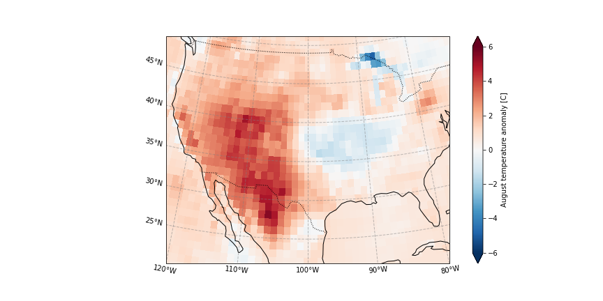
Temperature anomaly
[15]:
plot_California(ERA5_anomaly.sel(time = '2020'))
plt.savefig('graphs/California_anomaly.png')
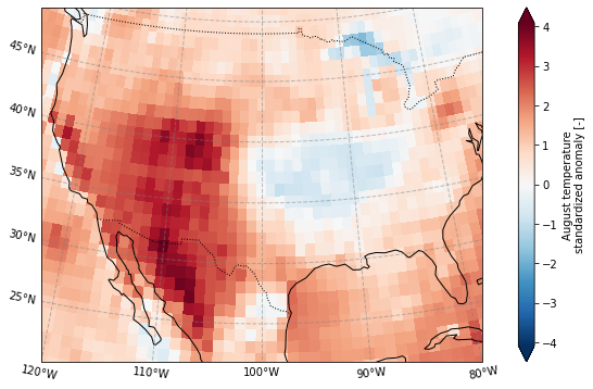
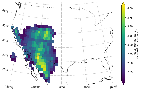
Plot the standardized anomaly
[16]:
plot_California(ERA5_sd_anomaly.sel(time = '2020'))
plt.savefig('graphs/California_sd_anomaly.png')
Define mask as higher than 2 standard deviation anomaly
[17]:
ERA5_masked = (ERA5_sd_anomaly.
               sel(longitude = slice(-125,-100),
                  latitude = slice(45,20)).
               where(ERA5_sd_anomaly.sel(time = '2020').
                     squeeze('time')>2)
              )

# ERA5_masked
plot_California(ERA5_masked.sel(time = '2020'))
[21]:
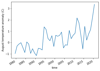
ERA5_anomaly_timeseries = ERA5_anomaly.sel(longitude = slice(-119,-100)).where(ERA5_sd_anomaly.sel(time = '2020').squeeze('time')>2).mean(['longitude','latitude'])
ERA5_anomaly_timeseries.plot()
plt.ylabel('August temperature anomaly (C)')
plt.savefig('graphs/California_anomaly_timeseries.png')
[21]:
[<matplotlib.lines.Line2D at 0x241db54c790>]
[21]:
Text(0, 0.5, 'August temperature anomaly (C)')